Step 2: Data Exploration with Spark Notebooks
Now that we have a nice structure to our data, it’s time to explore some of our data sets using Notebooks. Conveniently, Qubole Notebooks can create some quick visualizations to help get us started in understanding our data. In this section we will cover:
- Creating Basic Notebook Visualizations from Hive Table
- Filtering Data with Notebook Widgets
- Build Dynamic Forms for Dashboarding
Using the Advanced Analytics Retail Notebook, we want to understand what is happening with each product order.
Basic Notebooks Visualization
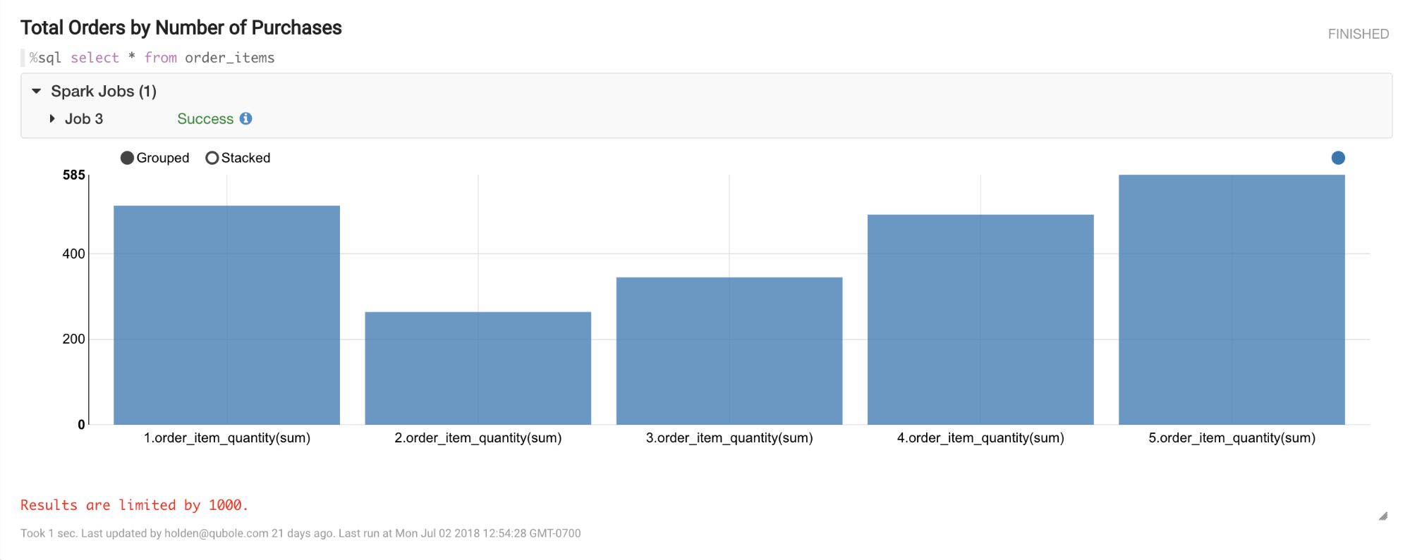
To do this, we can use Notebooks to quickly plot in a graph all the data in the order_items table and then use the graph widgets included to make a bar chart.
Enter:
%sql select * from order_items

Filtering Data in Notebooks
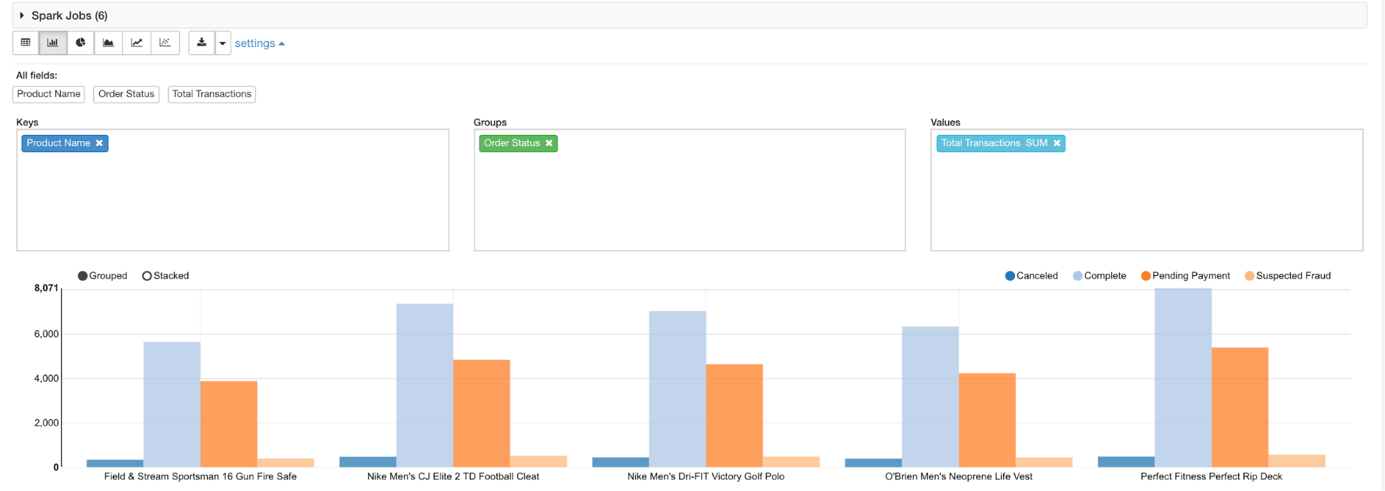
Once we have our results, we can group and filter specific data points. Our available fields are “Product Name”, “Order Status”, and “Total Transactions.”
In order to see each transaction by product, we’ll need to make our data key “Product Name” and group by “Order Status”, then use the SUM of our “Total Transactions” column to populate the graphs:

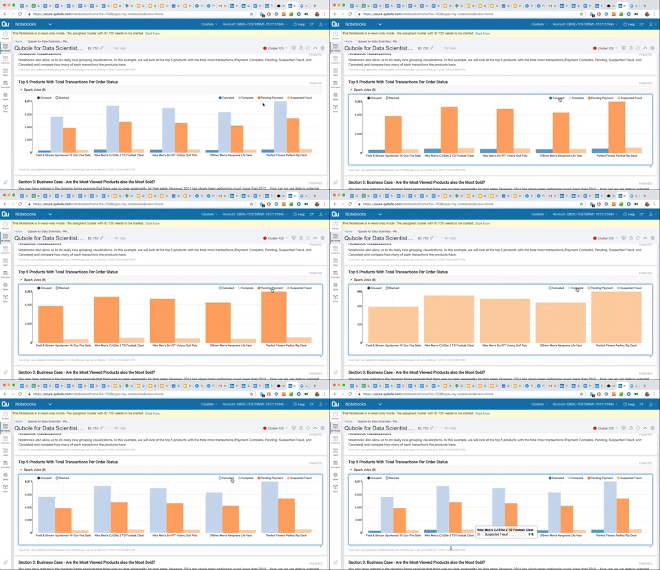
From there, we can explore different data points further by hiding different purchase actions such as how many purchase events (Canceled, Completed, Pending, and Fraud) are happening across each product:

Using Dynamic Forms with Notebooks for Dashboarding
Notebooks are also a great way to do some interactive queries, and can be set up like a visualization dashboard. Using %sql we can make form fields in our where statement using $ followed by {name=value}, which contains the selected column. This can also be done with Python and Scala (visit the Dynamic Form page for more examples).
In the example below, we have created a drop-down menu where a user can select each month to easily define a range of dates. Since each month is keyed in numbers, we’ll have to label each key with the month name:
where month(o.order_date) between ${Month Begin==1,1(Jan)|2(Feb)|3(Mar)|4(Apr)|5(May)|6(Jun)|7(Jul)|8(Aug)|9(Sep)|10(Oct)|11(Nov)|12(Dec)} and ${Month End==2,1(Jan)|2(Feb)|3(Mar)|4(Apr)|5(May)|6(Jun)|7(Jul)|8(Aug)|9(Sep)|10(Oct)|11(Nov)|12(Dec)}Notice at the beginning of each bracket, we’ve also labeled each section as “Month Begin” and “Month End”. By selecting a range of months and separating them in a string using the vertical bar key |, we can then run the paragraph to create a drop-down menu that will populate in the Notebook paragraph. We’ve also renamed the values from an integer with (month name) next to each value.

Try it yourself by selecting different years and months to analyze purchases over different periods of time.


