Step 3: Advanced Analytics and Dashboarding
Visualizations in Qubole Notebooks are not limited to the graphing functions available out of the box. In order to use third-party visualizations, we’ll need to go back into the Spark Qubole Notebook and select the relevant libraries we want to import from our packages. In this section, we will:
- Import Pandas and libraries for plotting
- Use Pandas DataFrame
- Advanced Visualization with Maps
Using Different Packages and Libraries with Apache Spark
The example libraries used are all contained in this Earthquake Visualization Notebook (MatPlotLib, Plotly, and Folium Maps). In order to use some of these more advanced visualizations, we’ll need to import our Pandas library by converting our Spark DataFrame into a Pandas DataFrame*, which has more features than just Spark alone.
First we’ll create and visualize the year_count table. Given we’re using Python here we’ll also need to initialize it with %PySpark
%pyspark
year_count = eq.groupby(eq.year).count().sort(eq.year)
z.show(year_count)
Next, we’ll convert the year_count table into a Pandas Dataframe:
yc = year_count.toPandas()
*Important note: this method collects the data from Spark executors and brings it all to the Spark driver, which can cause the Notebook to not run if using too large of a data set.
Visualization with Plotting Packages
Now that we have our Pandas DataFrame defined, we can start to use some of our plotting libraries. We’ll start by importing MatPlotLib, followed by Plotly.
MatPlotLib
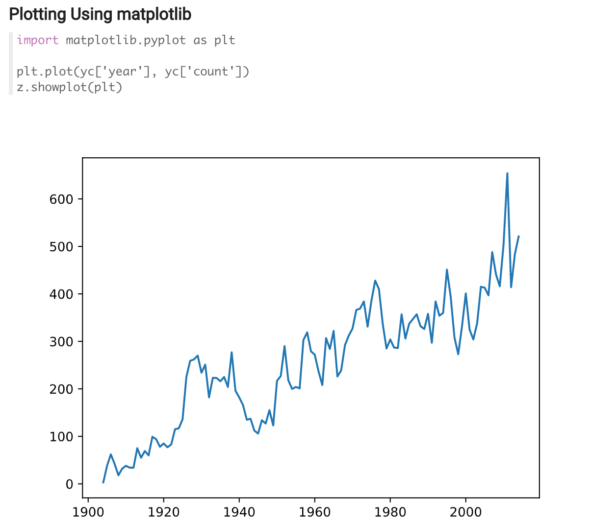
Using PySpark’s import command we can load in MatPlotLib and use our Pandas DataFrame create our visualization.
import matplotlib.pyplot as plt

plt.plot(yc['year'], yc['count'])
z.showplot(plt)
As you can see below, we are now able to get a very clean visual of the number of earthquakes that are happening each year.

Plotly
Similar to the prior example, we are going to use the import command to use Plotly, and we’re also going to import Plotly’s graph_objs function to be able to interact with the visualization.
import plotly

import plotly.graph_objs as go
Once we’ve imported Plotly, we need to define our plot function and create our axis
def plot(plot_dic, width="100%", height="100%", **kwargs):
    kwargs['output_type'] = 'div'
    plot_str = plotly.offline.plot(plot_dic, **kwargs)
print('%%angular‘ % (height, width, plot_str)) trace = go.Scatter( x = yc[‘year’], y = yc[‘count’] ) data = [trace] plot(data)
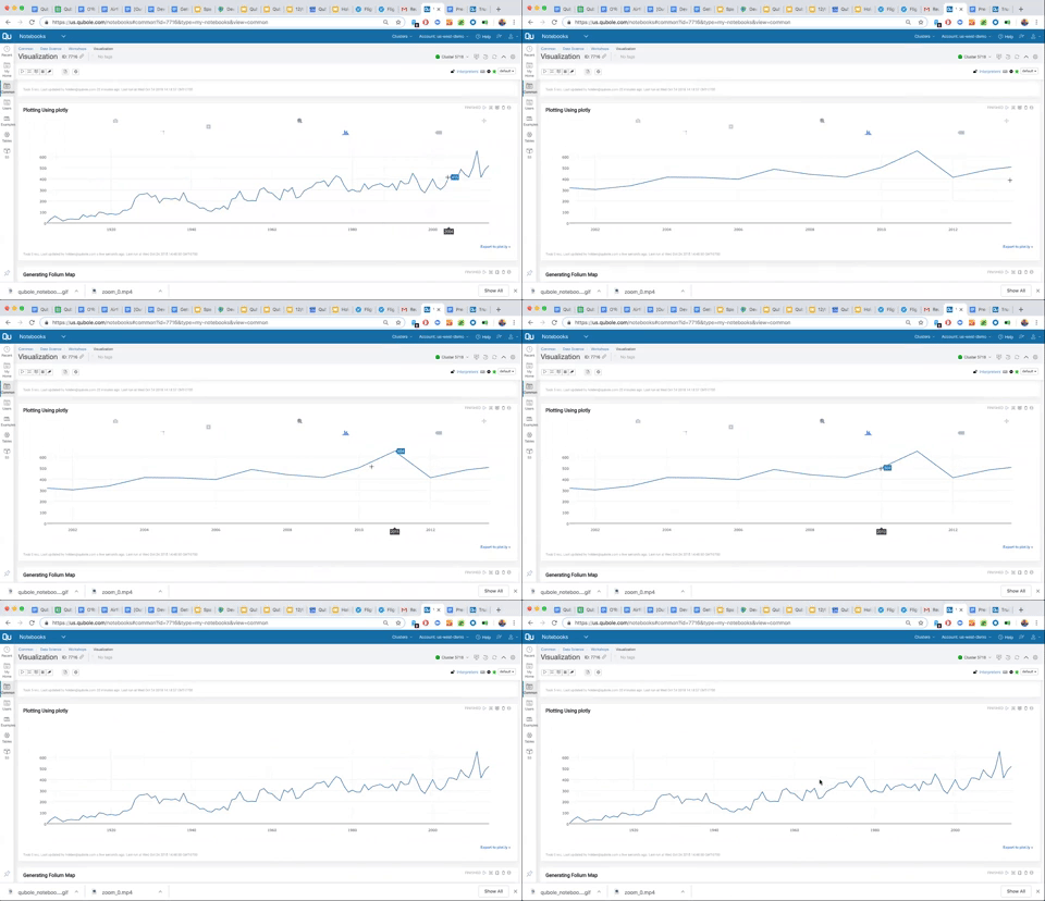
As you can see in the visualization below, all Plotly graphs in Qubole notebooks offer interactivity for further exploration. We can also click down into specific dates and dig into the data further.

Advanced Plotting with Maps
The final library we will use in this example is Folium, a Python visualization library, which allows you to create and plot in a variety of Leaflet maps. We’ll start again by importing the library –
import folium
We also need to define another Pandas DataFrame on our EarthQuake (eq) table; we’ll name this local_eq. We also need to define our Folium map, which we’ll call eq_map.
local_eq = eq.toPandas()

eq_map = folium.Map()
From there we can use PySpark generate the Folium Map with a For loop.
for i in range(1000):
    folium.Circle(location = [local_eq.at[i, 'lat'], local_eq.at[i, 'lon']],
                           radius = local_eq.at[i, 'depth'] ** 2,
                           color='blue',
                           fill_color='blue',
                           fill_opacity=.3,
                           fill=True).add_to(eq_map)
In the next paragraph, we’ll run Folium and use the plots that we just generated to populate a map visualization in the Notebook.

Now that we’ve concluded the basics of data processing with Spark and using Notebooks, proceed to the next section on the machine learning workflow with Qubole.


